Every figure in From Heatmaps to Histograms, in full color and high resolution.
The book was designed in color. The ebook is in color, the print edition is black and white, and in both, some figures came out fuzzy. Here are all 46 figures as they were meant to look, in full color and at full resolution. Select any figure to open the full-size version.
The set covers the risk matrix and its quantified alternatives, loss exceedance curves, Monte Carlo simulation, the six forms of loss, expert elicitation, Bayesian updating, the full FAIR model, and the program-building frameworks from the last part of the book. Several have interactive versions on the tools page. A few figures have been redrawn for clarity since the book went to print, and the ones corrected since print are noted below and listed on the errata page.
Chapter 1: Welcome to the Rebellion
Figure 1-1. The cyber risk incentive loop: why the system perpetuates itself
Chapter 2: Probability’s Plot Twist
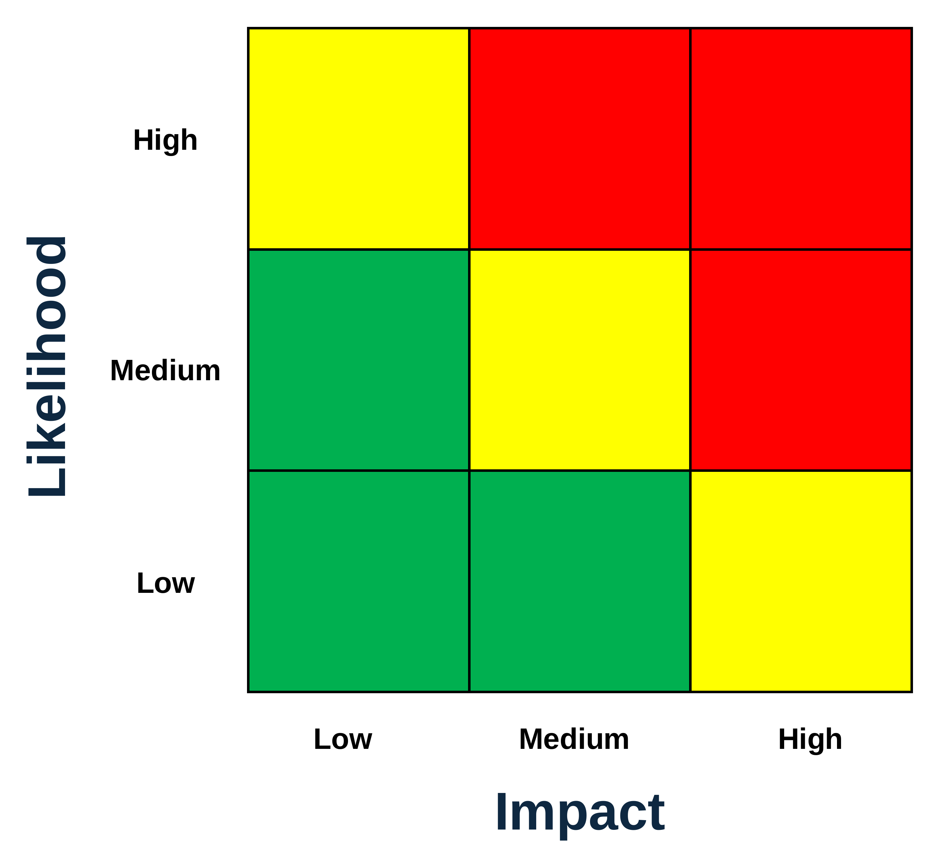
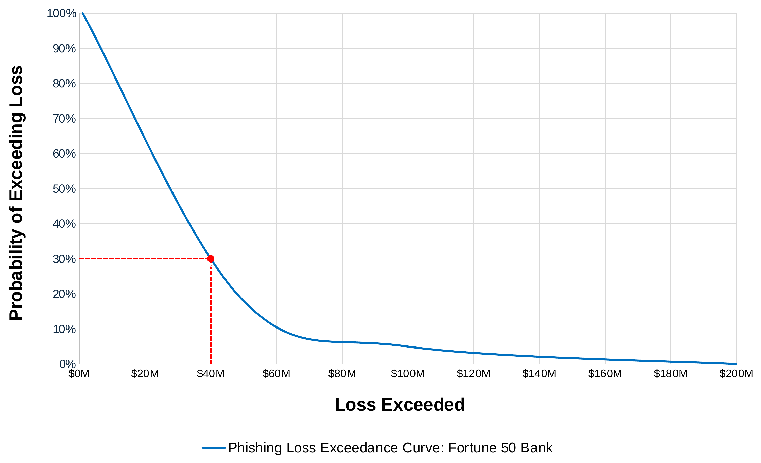
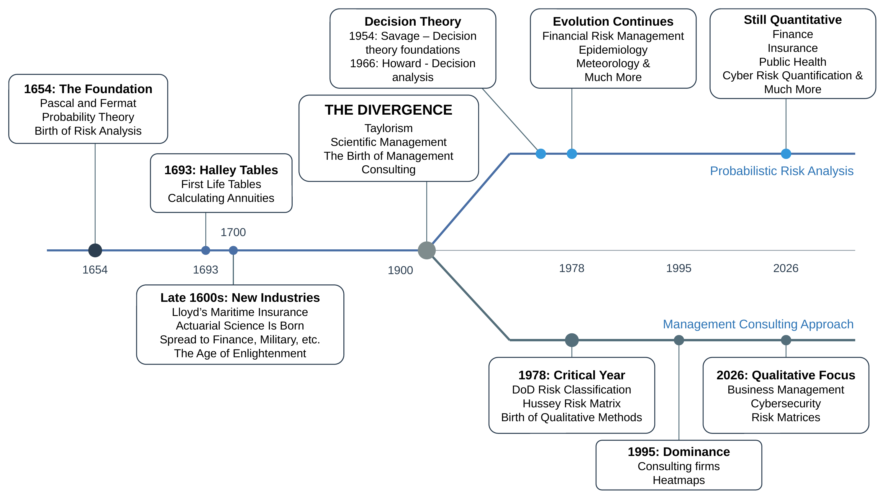
Figure 2-1. The risk matrix, a model in qualitative risk analysisFigure 2-2. A loss exceedance curve (LEC), one of several visualizations used in CRQFigure 2-3. High-level timeline of the divergence of risk analysis methods
Chapter 4: Foundations
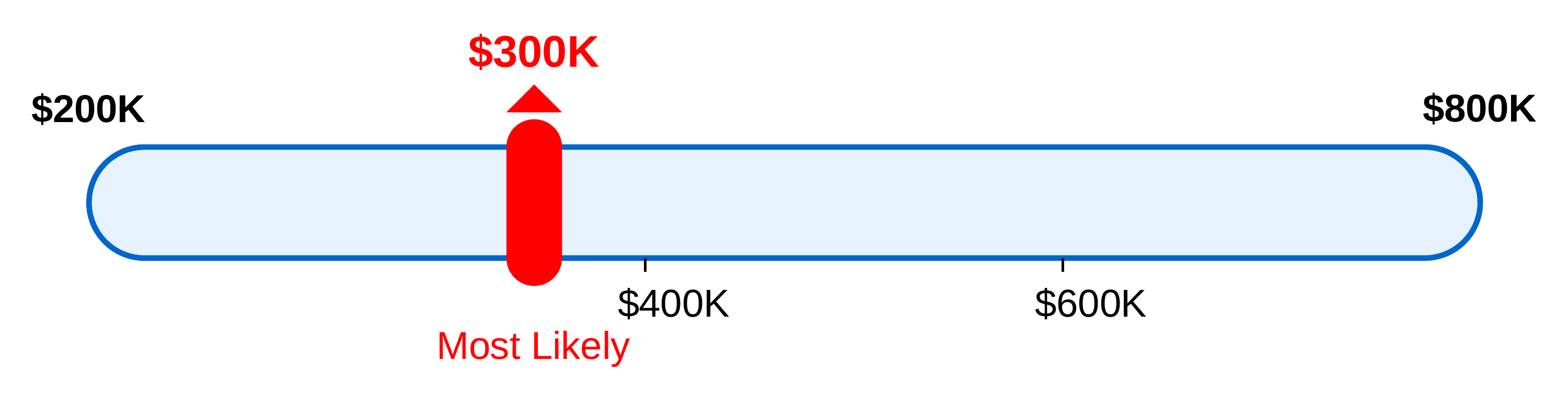
Figure 4-1. Example input range for ransomware lossesFigure 4-2. The classic risk equationFigure 4-3. How ranges combine in a Monte Carlo simulation
Chapter 6: Interpreting and Communicating Quantitative Results
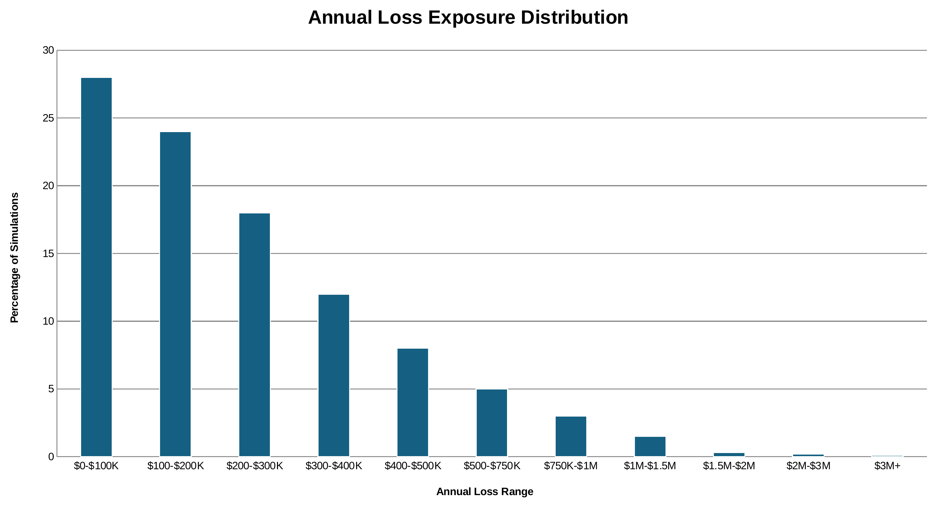
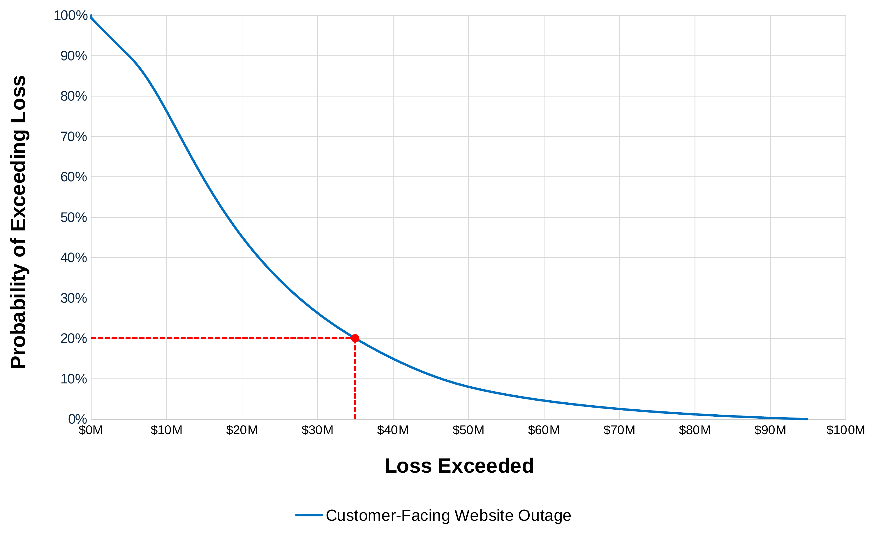
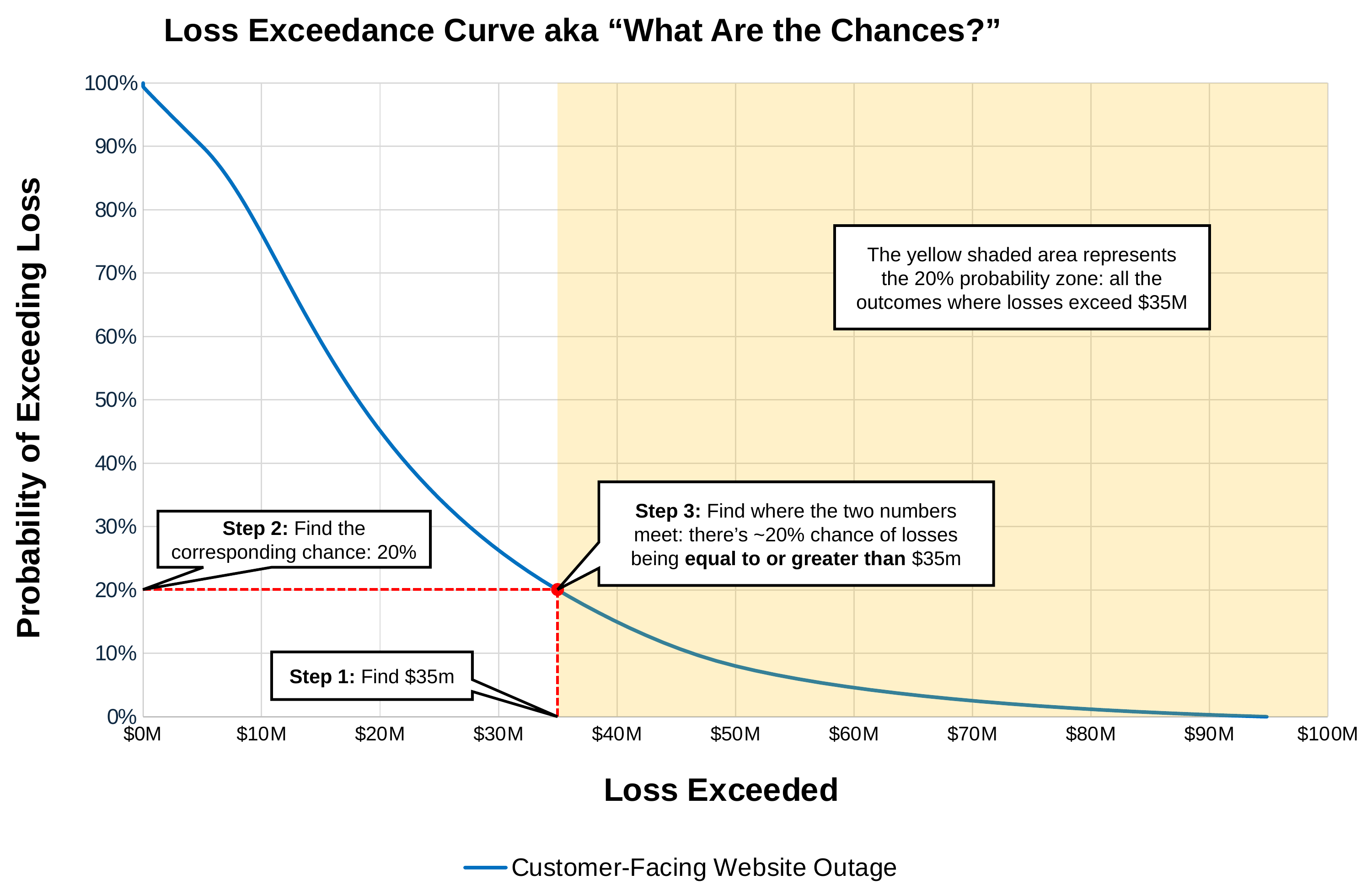
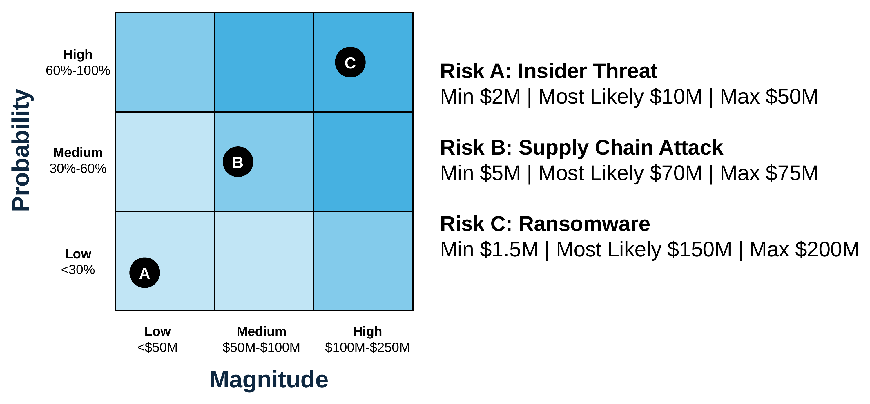
Figure 6-1. Monte Carlo simulation results graphed on a histogramFigure 6-2. An exec-ready loss exceedance curve showing a ~20% chance of losses exceeding $35 million or moreFigure 6-3. How to read a loss exceedance curveFigure 6-4. A traditional risk matrix: standard 3×3 grid showing a typical qualitative approachFigure 6-5. A quantitatively anchored heatmap. Corrected since print; see the errata.
Chapter 7: From Risk Statements to Assessment Scope
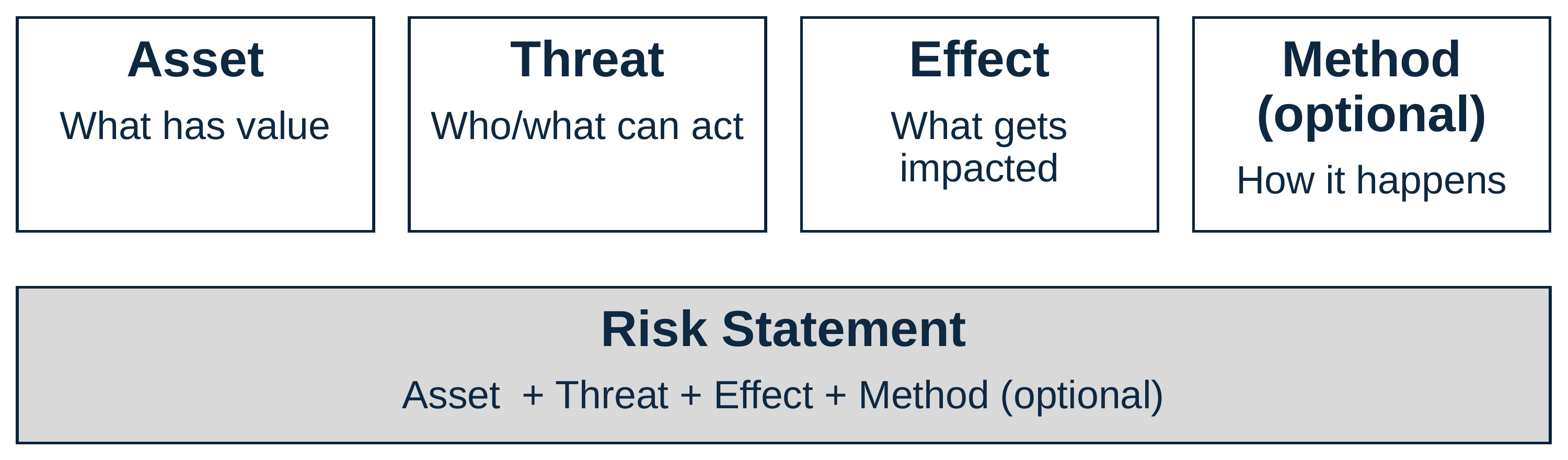
Figure 7-1. The progression of a vague worry into a quantified assessmentFigure 7-2. The components of a risk statement
Chapter 8: Understanding Loss: The Six Forms
Figure 8-1. One ransomware incident creates five different types of perceived loss, each mattering to different stakeholdersFigure 8-2. The six forms of loss. Corrected since print; see the errata.Figure 8-3. Prioritize your effort
Chapter 9: Getting Unstuck with Data
Figure 9-1. Simplified influence diagram for a ransomware decisionFigure 9-2. The three essential data sources
Chapter 10: How to Vet and Believe Your Data
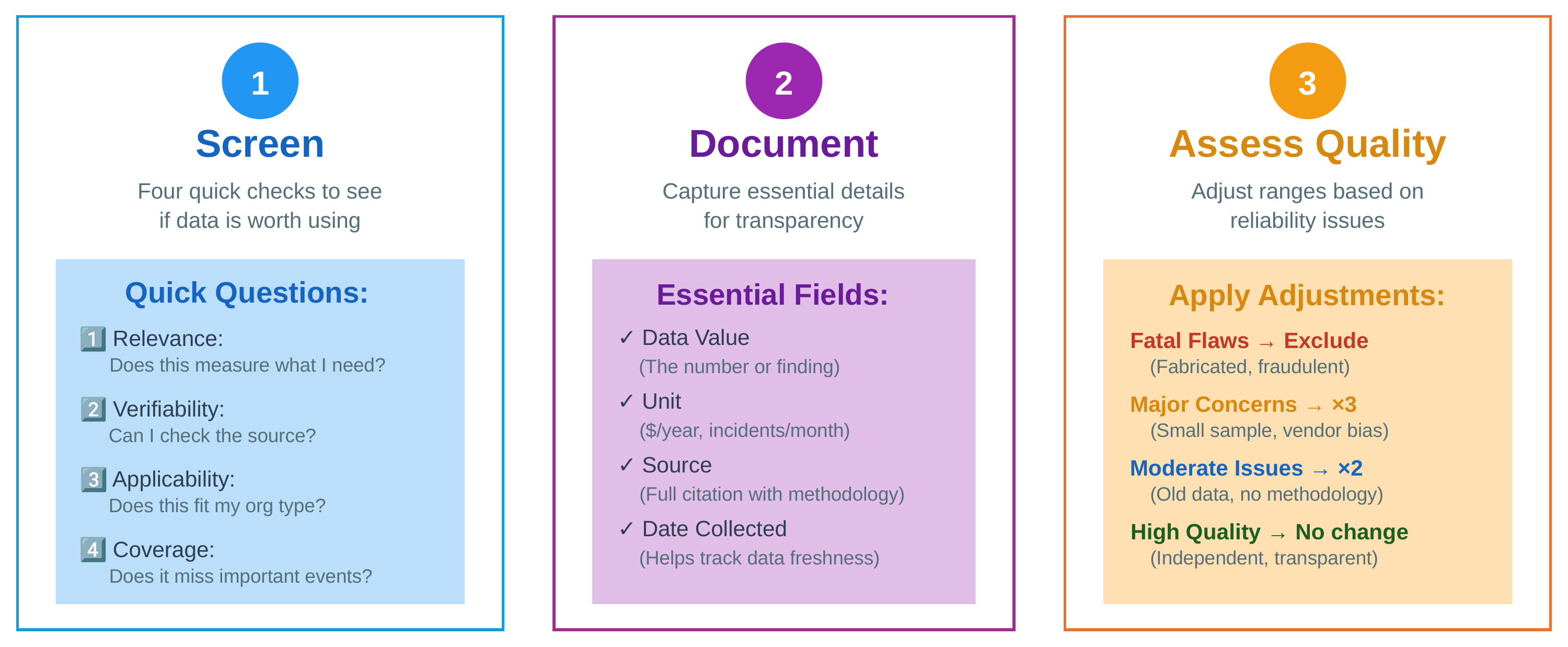
Figure 10-1. The three-step data evaluation processFigure 10-2. Quality assessment decision tree: apply the four screening criteria systematically to determine if data sources are worth using
Chapter 11: Finding and Using External Data
Figure 11-1. How base rates are used in risk analyses
Chapter 12: Your Best Evidence: Finding and Using Internal Data
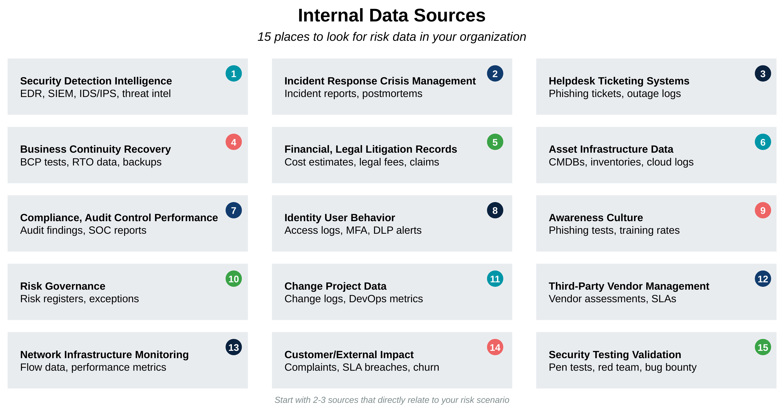
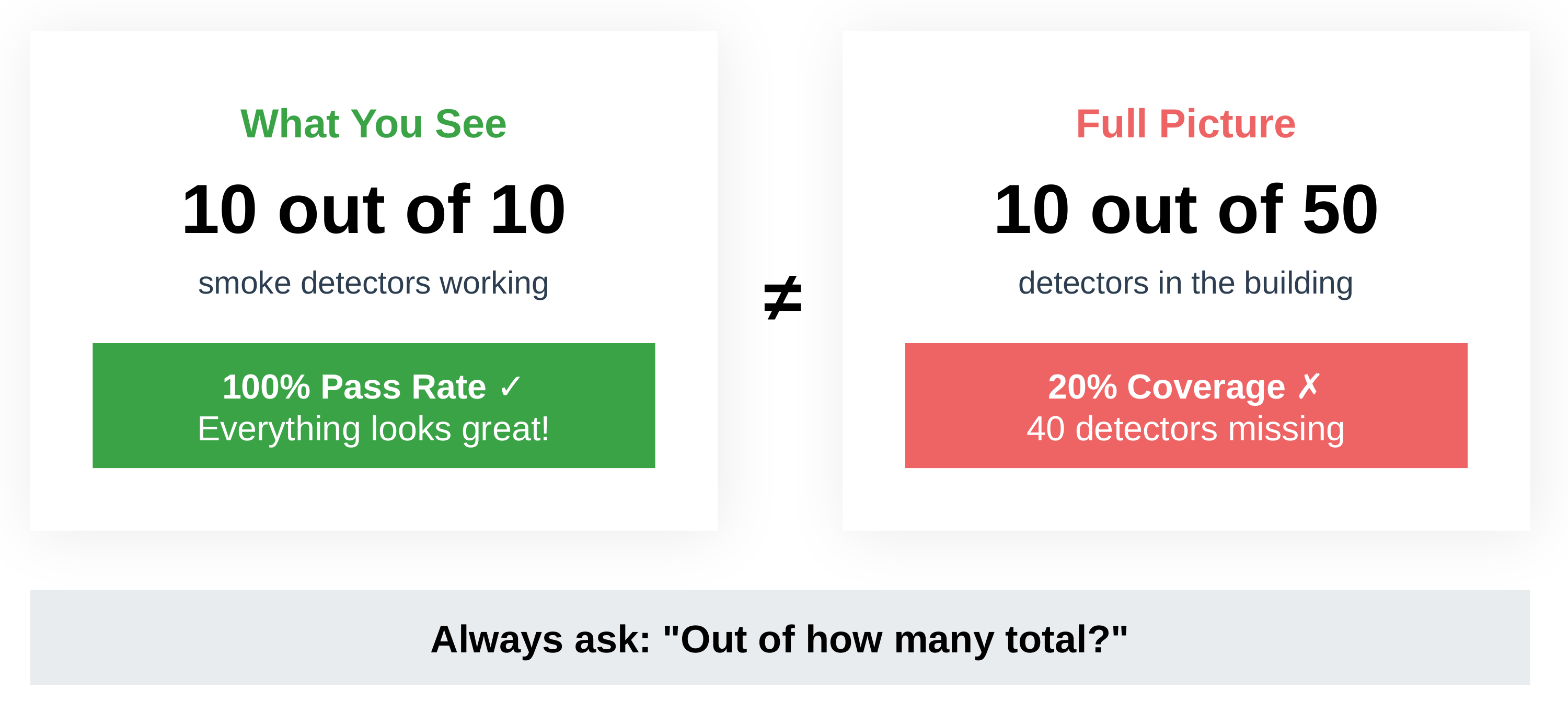
Figure 12-1. Fifteen places to look for internal data sourcesFigure 12-2. Some teams to ask for data and what to ask forFigure 12-3. Why knowing the coverage rate matters
Chapter 13: Your Secret Weapon: Subject Matter Experts
Figure 13-1. Overview of the types of subject matter expertsFigure 13-2. Constant feedback loops can result in natural calibrationFigure 13-3. Overview of steps when holding a Mini-Delphi style elicitation workshop
Chapter 14: How to Blend Data
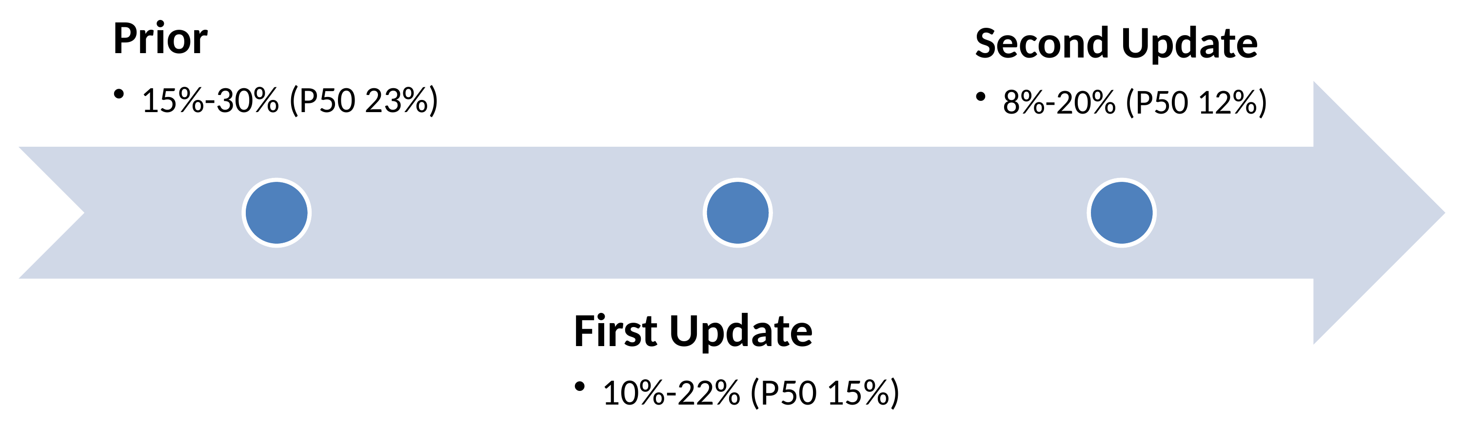
Figure 14-1. Bayesian updating is cyclicalFigure 14-2. The three sources of data blend together to provide additional contextFigure 14-3. Refining estimates through updating. Corrected since print; see the errata.
Chapter 15: Extending This to CRQ
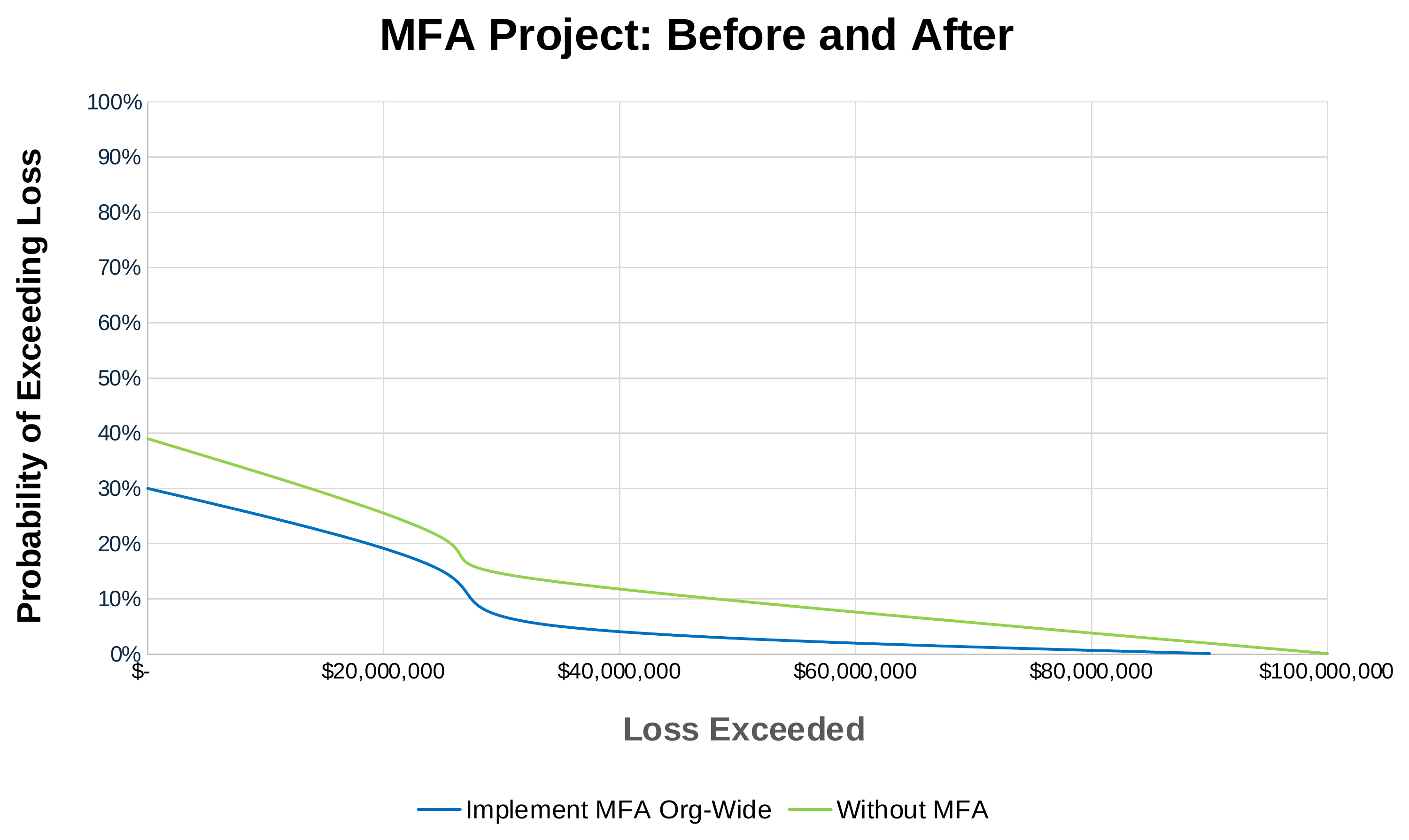
Figure 15-1. The CRQ assembly mapFigure 15-2. Example loss exceedance curve of how an org-wide MFA implementation reduces risk
Chapter 16: Extending to FAIR
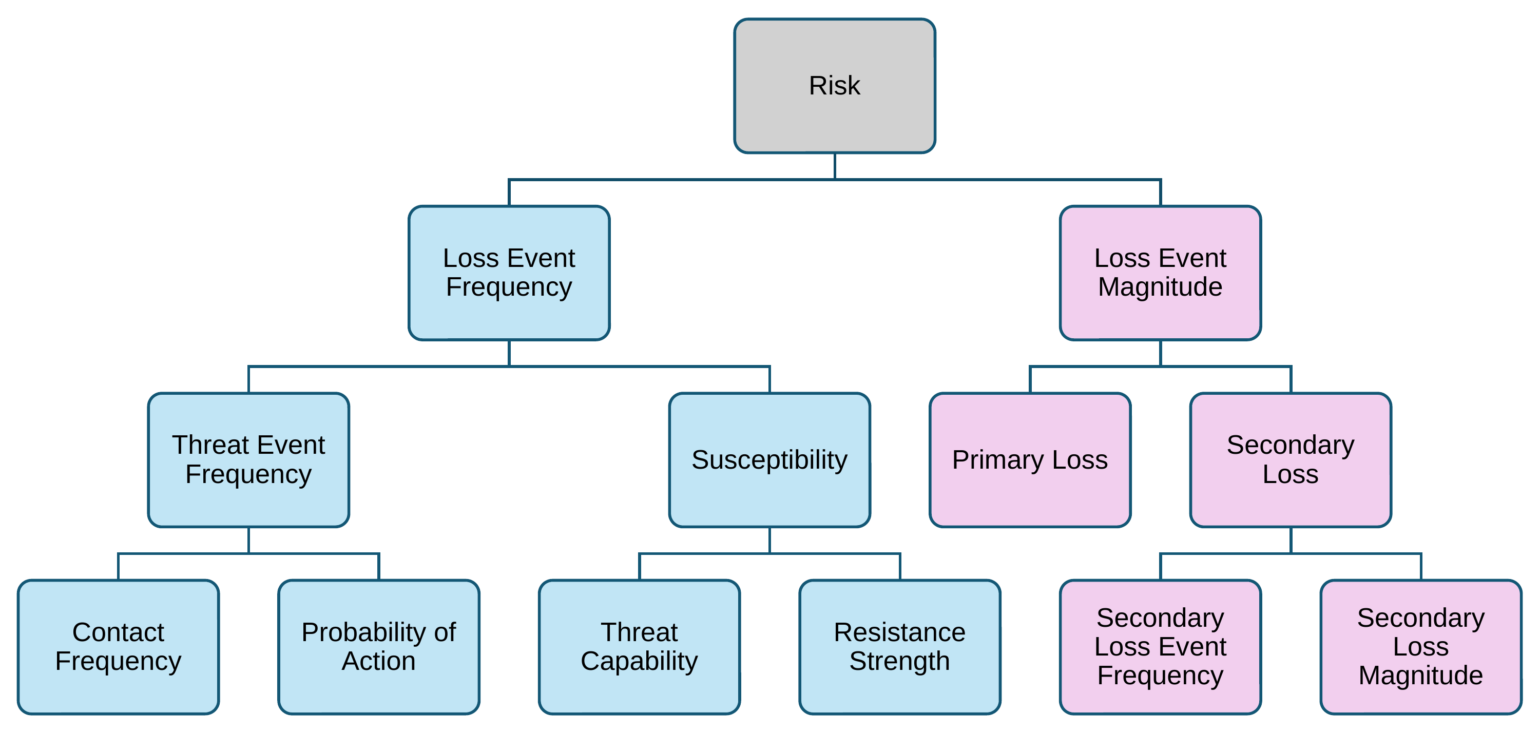
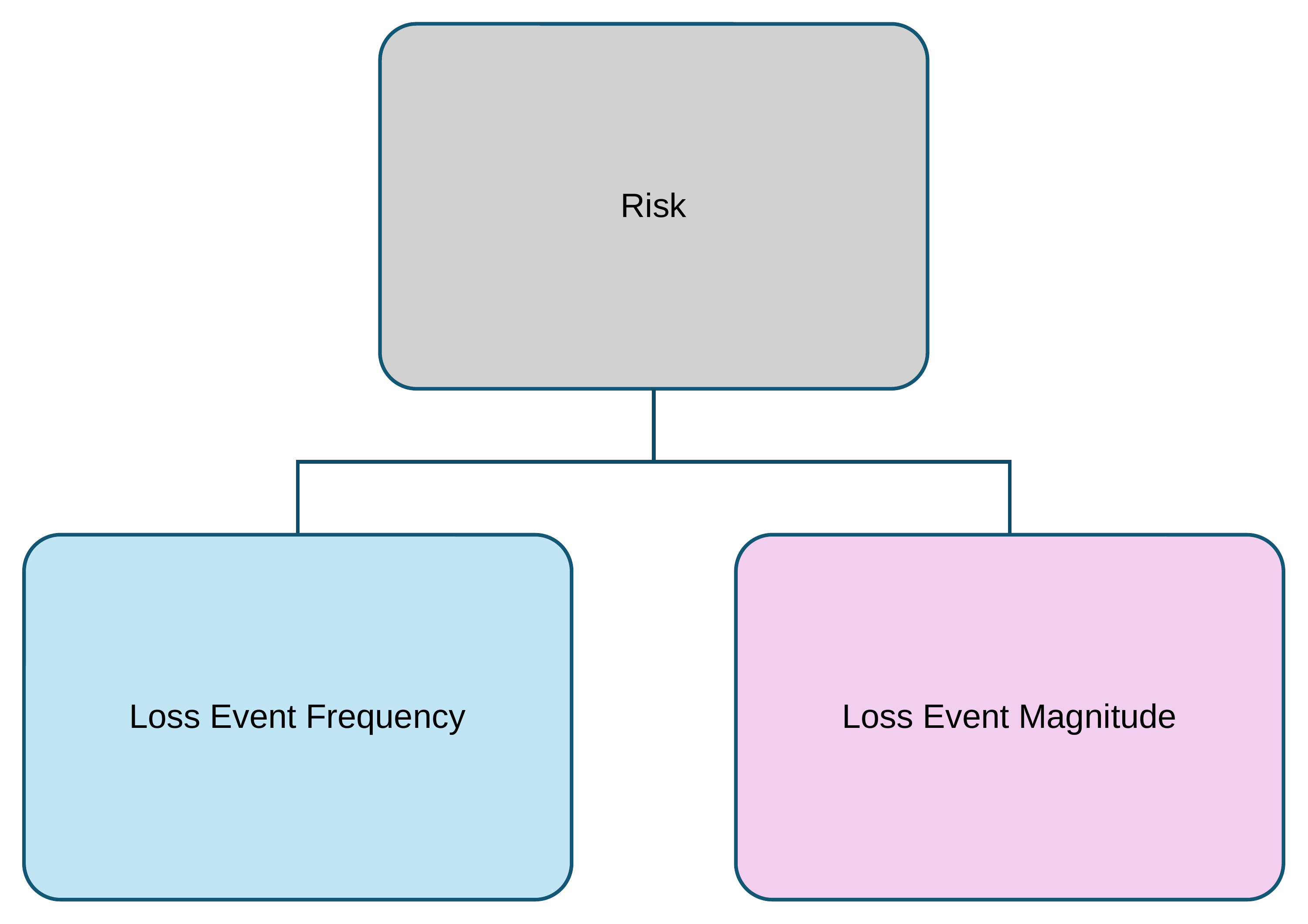
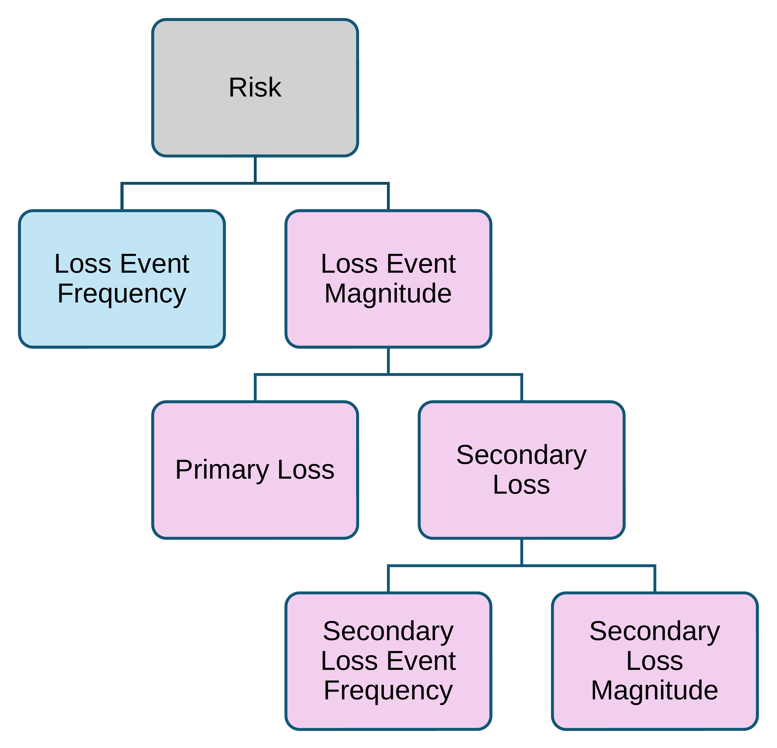
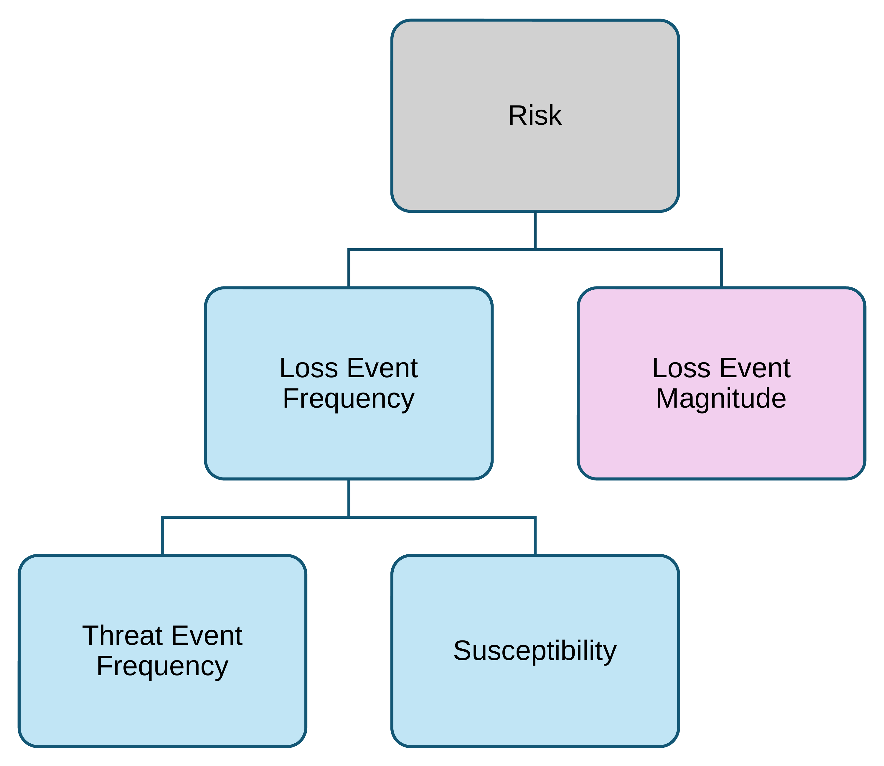
Figure 16-1. Full FAIR model. Adapted from Risk Taxonomy (O-RT), version 3.1 (The Open Group, 2021)Figure 16-2. Using FAIR at the Loss Event Frequency and Loss Event Magnitude level. Adapted from Risk Taxonomy (O-RT), version 3.0.1 (The Open Group, 2021)Figure 16-3. Loss Event Frequency is top-level; Loss Event Magnitude is fully decomposed. Adapted from Risk Taxonomy (O-RT), version 3.0.1 (The Open Group, 2021)Figure 16-4. Decomposing Loss Event Frequency enables control evaluations. Adapted from Risk Taxonomy (O-RT), version 3.0.1 (The Open Group, 2021)
Chapter 17: How to Run a Complete CRQ Assessment
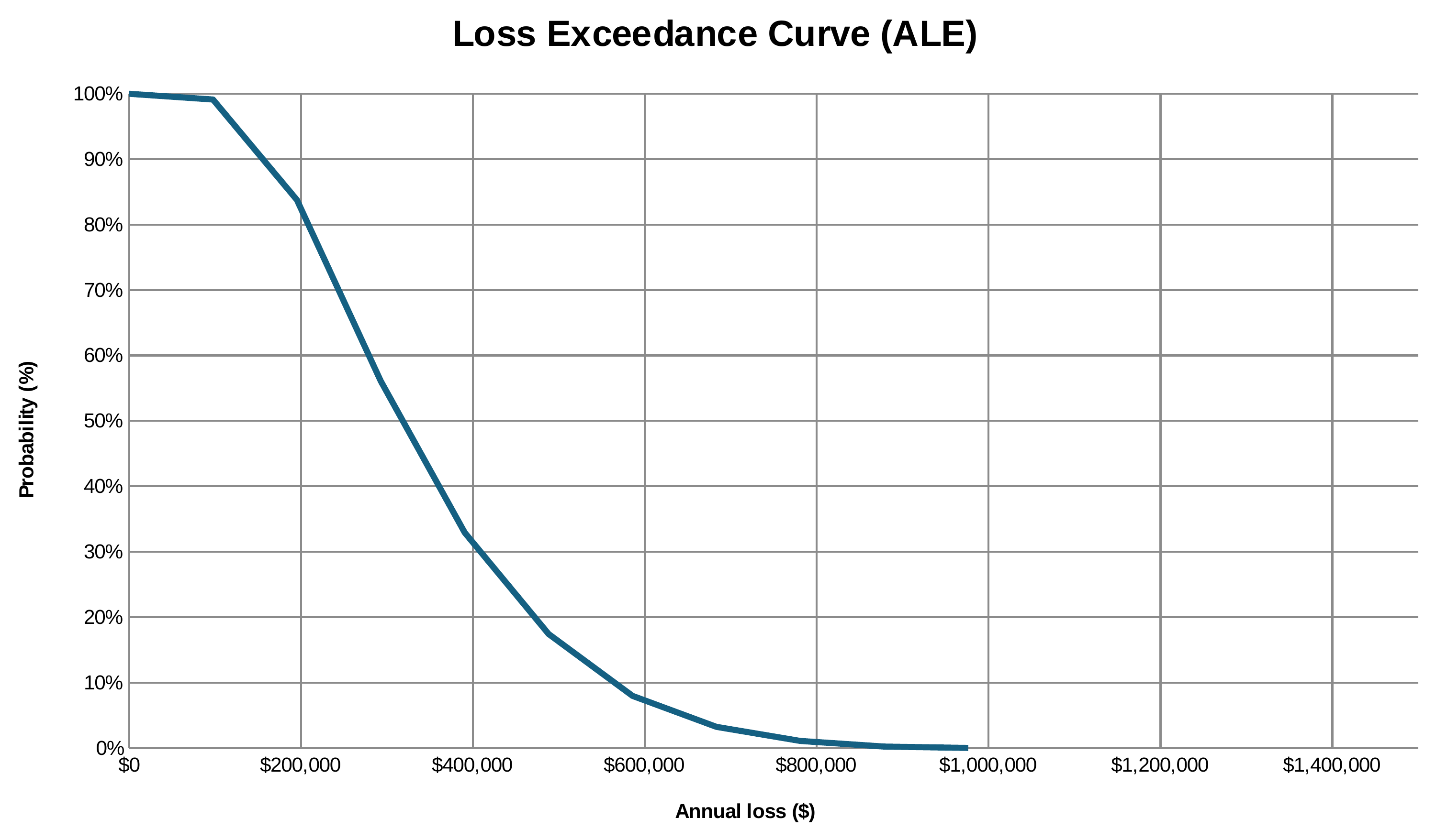
Figure 17-1. Loss exceedance curve for the ransomware scenario. Corrected since print; see the errata.
Chapter 18: CRQ in the Org
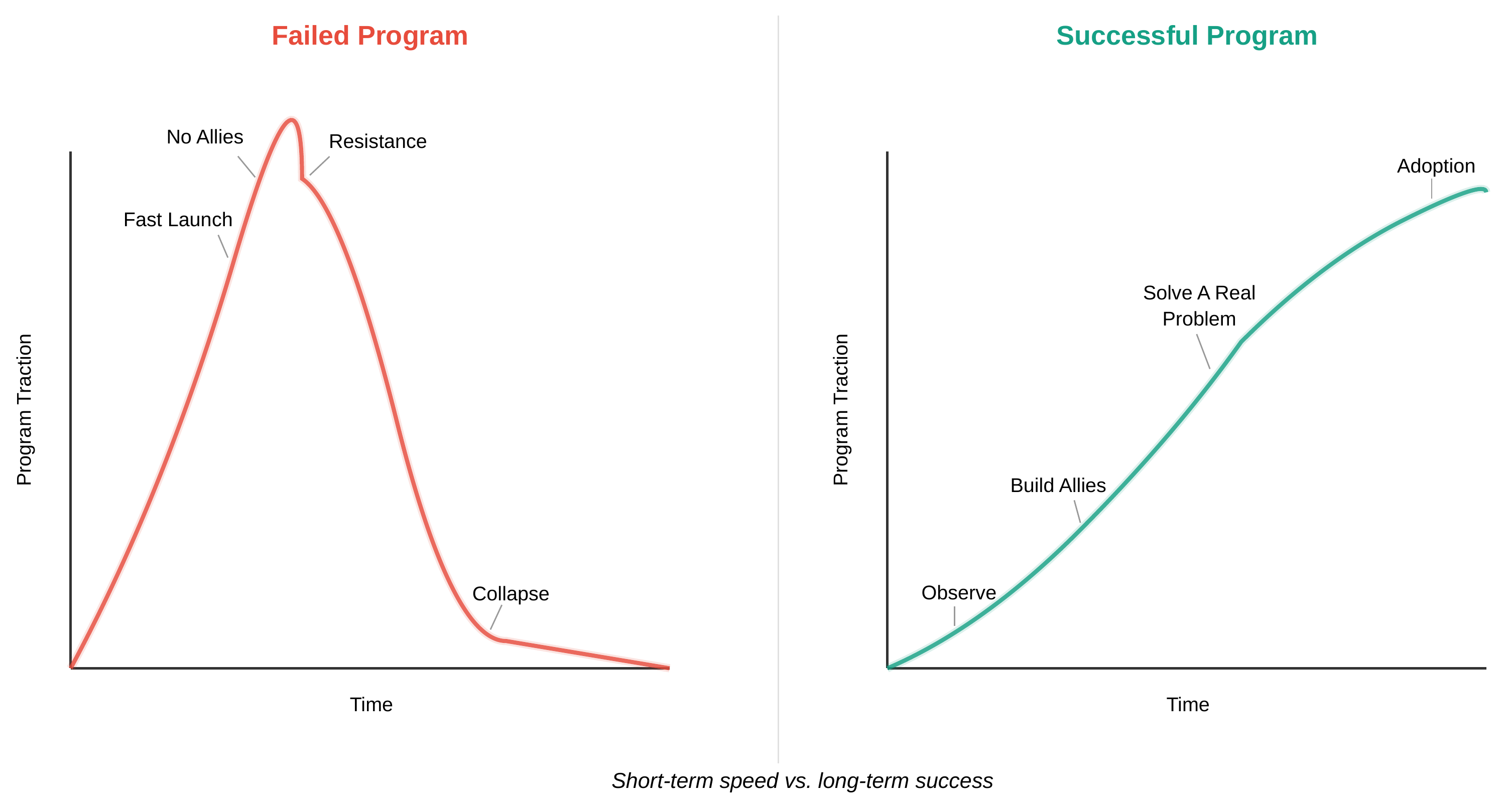
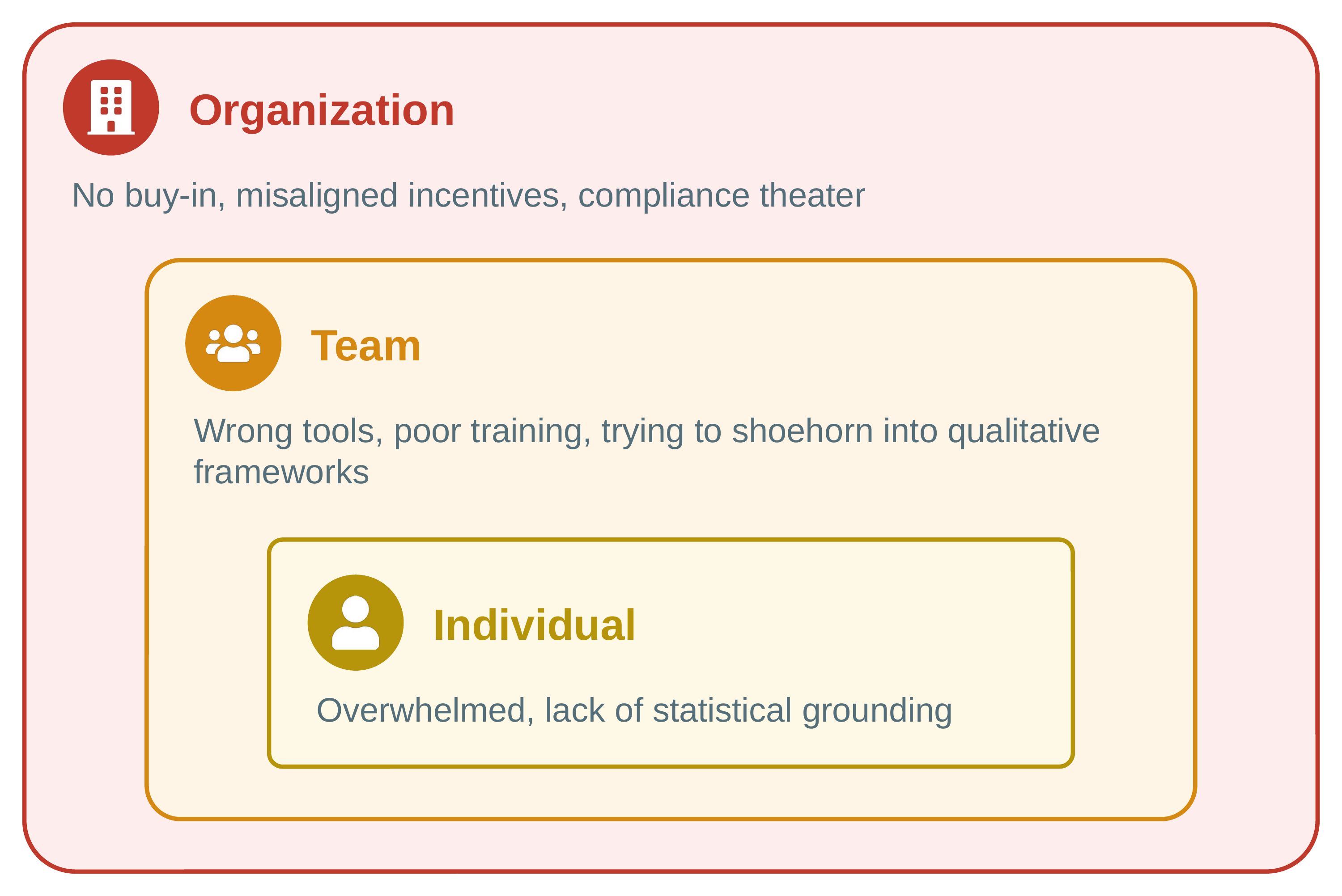
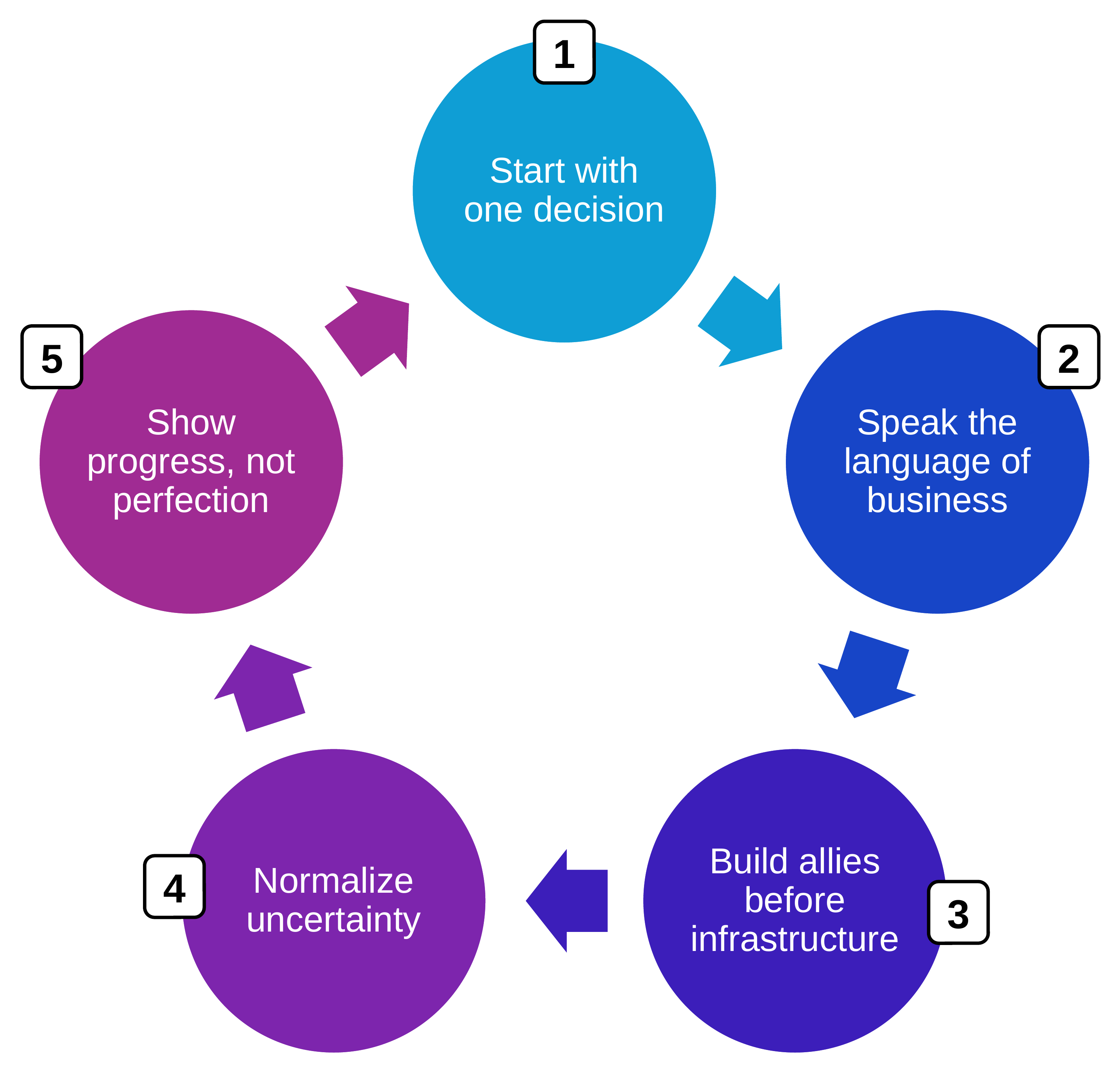
Figure 18-1. Two CRQ programs: one prioritized for speed (left) and the other for long-term success (right)Figure 18-2. CRQ programs can fail at three levelsFigure 18-3. Steps to make a CRQ program succeedFigure 18-4. Overview of the six levers that quietly change risk
Chapter 19: Making Better Decisions with CRQ
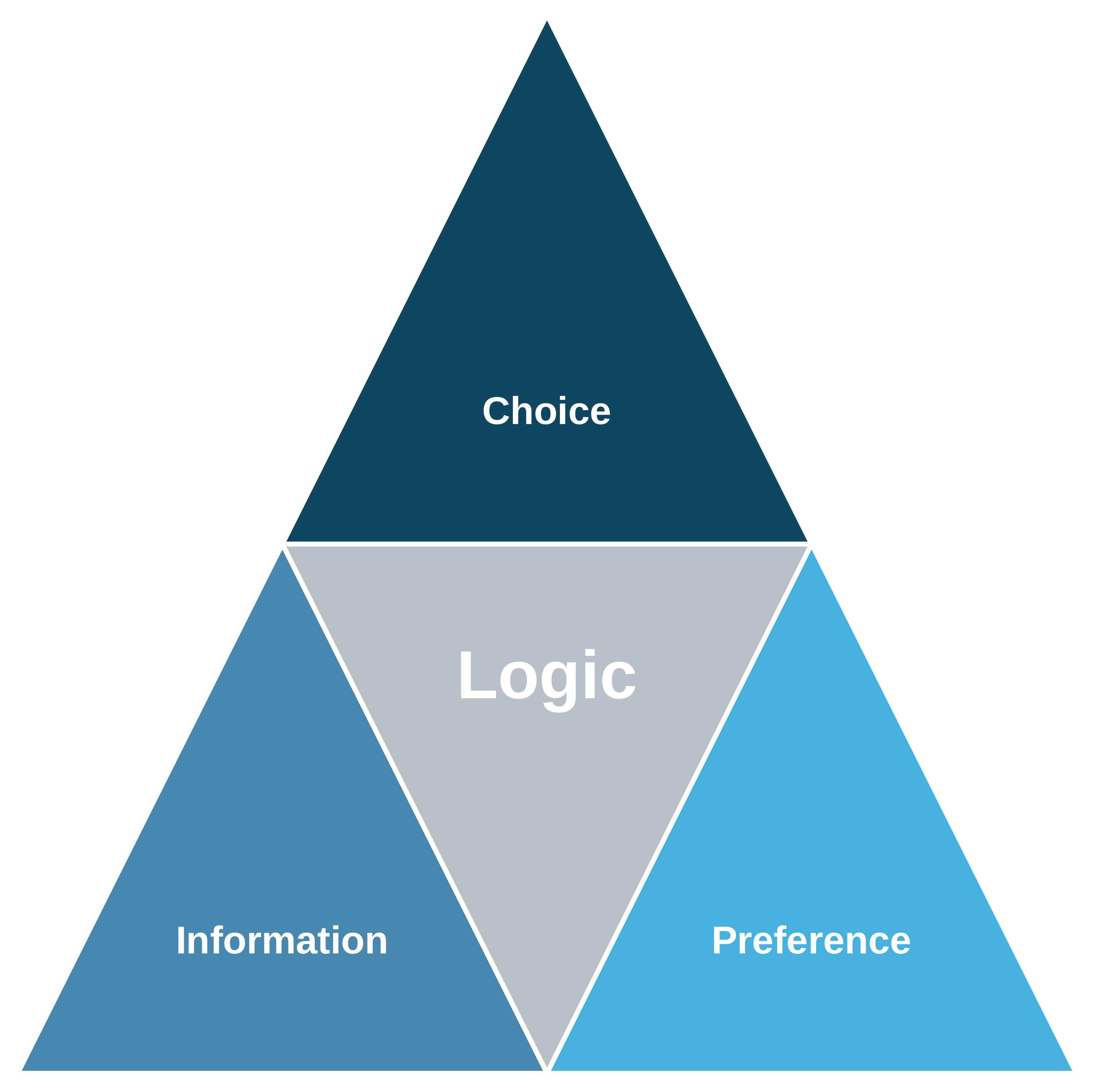
Figure 19-1. The components of a decisionFigure 19-2. Use cases for quantitative risk
Chapter 20: The Future of CRQ (And Yours Too)
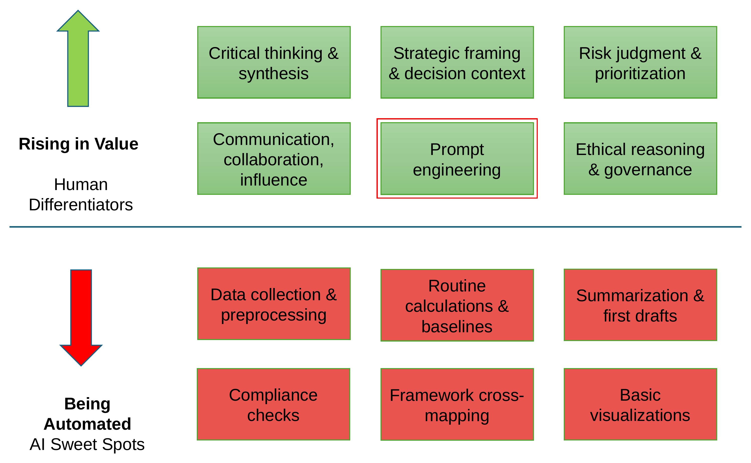
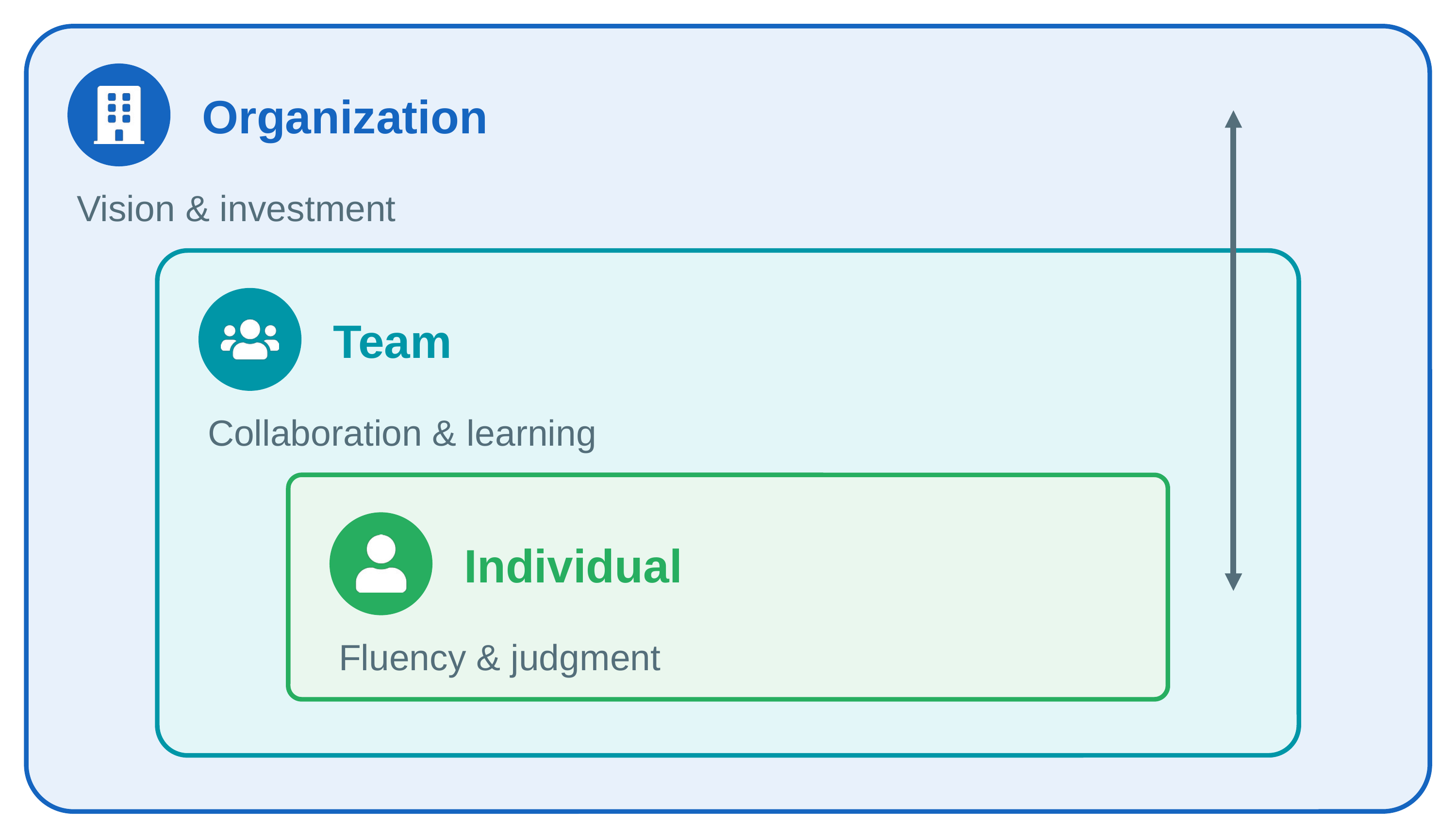
Figure 20-1. Risk analyst skills that are rising in value vs. those being automatedFigure 20-2. Every level of adaptation grows the others


















 From Heatmaps to Histograms